Add Components
Components are used to define the sources of the information in the layout. Define components that are common across the custom types - Custom Report, Custom Form, and Custom Search Form or define components specific to Custom Reports only.
Common components
These components can be defined across the custom types:
Text Label
You can use a Text Label component to add descriptive text for a particular layout.
To add a Text Label:
- Do one of the following:
- Click the add icon
 in the Layout Builder and select: Text Label
 - Drag Text Label from the Palette and drop it in the Layout Builder
- Click the add icon
- Enter display text and apply style formatting options then Close.
Apply style and formatting to content
- To increase decrease or keep the font size normal, select the size icon
 , then select the options.
 - To change the font colour, select the text colour icon
 , then select a colour.
 - To apply bold, italics and underline, select the icons specific to these styles -
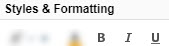 .
. - To replace or add value within the text field, select the text icon
 and do the following:
- To replace the available value, add the value within the <>.
- To add value after the available value, enter values after or before the <>.
- To increase decrease or keep the font size normal, select the size icon
- Check the Preview pane to verify the results.
Data Field
You can use a Data Field component to define a data source using field path notation. See Field Path Notation and Field Path Notation Syntax for examples.
To add a Data Field:
- Do one of the following:
- Click the add icon in the Layout Builder and select: Data Field.
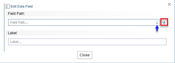
- Drag Data Field from the Palette and drop it in the Layout Builder. The Edit Data Field dialog displays:
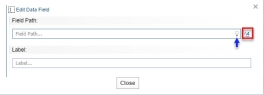
- Click the add icon
- In the Edit Data Field, enter a field path. Click the bulb icon
 for suggestions.
 - If you want to apply styles to the content, click the formatting icon
 , do the following, then select Apply.
Apply style and formatting to content
- To increase decrease or keep the font size normal, select the size icon , then select the options.
- To change the font colour, select the text colour icon , then select a colour.
- To apply bold, italics and underline, select the icons specific to these styles - .
- To replace or add value within the text field, select the text icon and do the following:
- To replace the available value, add the value within the <>.
- To add value after the available value, enter values after or before the <>.
Apply style and formatting to numbers
Select Number from the Format dropdown.
Fill the following fields with your preferred options:
Min Fraction Digits - Display the minimum number of digits after the decimal separator. For example, setting the minimum fraction digits to 3 displays the value of 1 as 1.000.
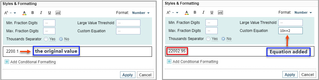
Max Fraction Digits - Display the maximum number of digits after the decimal separator and rounds the value when truncated. For example, setting the maximum fraction digits to 2 displays the value of 1 as 1.6666 as 1.67.
Large Value Threshold - Display the abbreviation of a unit. For example, setting up the unit as M (Million), displays the value of 1230000 as 1.23 M.
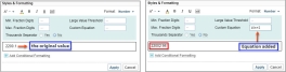
Custom Equation - Display the value using a common math expression such as 2n, n/10. The n in this case refers to the original value displayed in the field, and the equation is applied onto the original value, as shown in the following example:
Thousands Separator - Display a thousand separator, if yes is selected.
Apply style and formatting as per conditions
The following are some common usages of conditional formatting:
- colour coding based on numeric values.
- Remove bold from values that are empty or zero.
- Apply bold styles to values that are more than the set minimum value.
If you want to apply conditions to the formatting that you have set up for General or/and Number, do the following:
- Select Add Conditional Formatting.
- Select a condition from When value is equal to dropdown.
You can add a condition into the same condition. Select add another condition from the dropdown.
- Apply your preferred styles.
- To increase decrease or keep the font size normal, select the size icon
- Enter a label. This is a static title that describes the data shown by the field path.
- Select Close and Save
- Check the Preview pane to verify the results.
All Fields
You can use the All Fields component to add all the available fields for the selected node type.
To add All Fields:
- Do one of the following:
- Click the add icon in the Layout Builder and select: All Fields.
- Drag All Fields from the Palette and drop it in the Layout Builder.
- Click the add icon
- Add any exclusions in the Add Exclusion field and click Exclude.
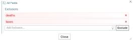
- Select Close.
- Check the Preview pane to verify the results.
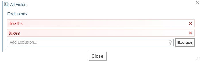
- To edit All Fields use the
 icon or click on N exclusions.
All Features
You can use the All Features component to add all the available features for the selected Node Type.
To add All Features:
- Do one of the following:
- Click the add icon in the Layout Builder and select: Add Features.
- Drag Add Features from the Palette and drop it in the Layout Builder.
- Click the add icon
- Add the exclusions in the Add Exclusion field and select Exclude.
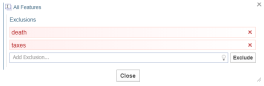
-
Click Close.
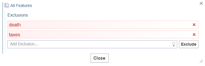
- Check the Preview pane to verify the results..To delete a line from All Fields or All Features click
 next to the line to be deleted.
 -
To edit All Features use the
icon or click on N exclusions.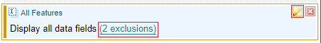
Custom Report Components
The following components can be used to define Custom Reports only:
Link Table
Use the Link Table component to view data that is available on a link or on the neighbouring node of a selected node. The data displays in a customisable table format.
To add a Link Table:
- Do one of the following:
- Click the add icon in the Layout Builder and select: Link Table.
- Drag Link Table from the Palette and drop it in the Layout Builder.
- Click the add icon
- In the Edit Link Table dialog, do the following:
- Under Link Relationship do the following only if you want to restrict column data to specific links or nodes:
- Select Set Link Type and enter a link type. Click the bulb icon for suggestions.
- Select Set Node Type and enter a node type. Click the bulb icon for suggestions.
- To add additional links or node types repeat the above steps.
- Under the Columns section, from the Column Type drop-down field, select from a data source:
neighbour Value
Enter a path in the Column Content field. Click the bulb icon
for suggestions.
Enter a label in the Column Label field. This is a static title that describes the data shown by the field path.
Sub-component
Hover for an explanation over the Column Content field.
Enter a label in the Column Label field.
Enter a width by moving the Width slider, or leave unchanged for auto-width.
Link value
Enter a path in the Column Content field. Click the bulb icon
for suggestions.
Enter a label in the Column Label field. This is a static title that describes the data shown by the field path.
When a link value is added to the custom report it allows ordering of link value.
Direction
Select the value under the Column Content field to change the arrow direction.
Select Add Column to add additional columns.
To open a Link Table for editing, double click or use the edit icon
.
Processing speed and memory will be impacted with nested multiple Link Tables.
To view results in a flat list instead of a table, create a Link table with a single sub-component column and remove the label. This will display a full-width vertically stacked sub-component list.
Use page size to limit initial displays. Use the page size option to move from one node to another in a 1-1 relationship by setting the Page Size to 1.
- Select Set Link Type and enter a link type. Click the bulb icon
- Under Link Relationship do the following only if you want to restrict column data to specific links or nodes:
Ordering
- Pick a field to order by in order by this neighbour node field text box, or Click the bulb icon for suggestions.
- Chose from ascending or descending order.
- Do one of the following:
- Drag and drop documents on to the Layout Builder.
- Click the add icon in the Layout Builder and select: documents to add.
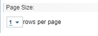
- Under Page Size section, click the dropdown to define the maximum number of rows per page.
- Check the Preview pane to verify the results..
- Click Close or click outside the menu.
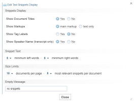
Text Snippets
If the associated documents has text snippets, you can use the Text Snippets component to add a summary view of associated documents.
To add Text Snippets:
Do one of the following:
- Click the add icon in the Layout Builder and select: Text Snippets.
- Drag Text Snippets from the Palette and drop it in the Layout Builder. The Edit Text Snippets Display opens automatically:
 Double click or use the right corner edit icon to manually edit once added to the Layout Builder.
- To toggle the Document Title display select Yes or No from Show Document Titles.
- To toggle the markup highlight display select main markup or text only from Show markups.
- To toggle tag the label display select Yes or No from Show Tag Labels.
- To toggle the speaker name select Yes or No from Show Speaker Name.
- To configure the maximum amount of contextual words before and after, from Snippet Text :
- Enter the minimum left words.
- Enter the minimum right words.
- To control the amount of information shown, from Size Limits, Do one of the following:
- Enter the maximum documents per page.
- For each document enter the most relevant snippets per document.
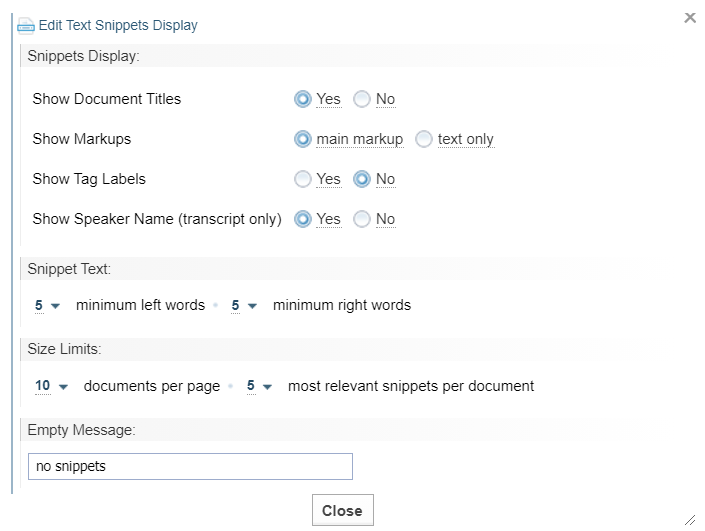
- Select Close.A place holder message will display when no snippets are available.Naming the Empty Snippets No Documents will display in the report when no documents appear.
-
Change or remove the default heading in Layout Builder.

- Name the Empty Snippets for the report.
-
Check the Preview pane to verify the results.
The appearance of the report will change depending on the configuration.
Source Doc
If the selected node has a source document, you can use the Source Doc component. Do one of the following:
- Click the add icon in the Layout Builder and select: Source Doc.
- Drag Source Doc from the Palette and drop it in the Layout Builder.
Document view
If there are associated documents of the current node, you can add a link to them using the Doc. View component. Do one of the following:
- Click the add icon in the Layout Builder and select: Doc. View.
- Drag Doc View from the Palette and drop it in the Layout Builder.
Image
If the selected node has an image, you can use the Image component. Do one of the following:
- Click the add icon in the Layout Builder and select: Image.
- Drag Image from the Palette and drop it in the Layout Builder.
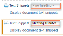
Saved components
You can save the custom reports components for re-use by using My Saved Components.
- Once custom report components have been saved to the Layout Builder, click-hold on the top left-hand corner, until the cursor becomes a hand symbol, then drag over to the My Saved Components section in the Palette.
- The component will be saved, and a box will appear within My Saved Components with a default generated label.
To use a saved component
Click-hold then drag the labelled component from My Saved Components box to the Layout Builder.
To change label
Double click on the saved component in the My Saved Components box or use Rename  in the Action menu.
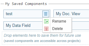
To remove a saved component
Use Delete in the Action menu.