Common Components
Common components can be used for all types of templates - Custom Report, Custom Form, and Custom Search Form.
For components that can only be used in Custom Reports, see Custom Report Components.
Text Label
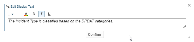
The Text Label component allows you to add any text to the template.
For example, you may want to include an explanation or a heading with bolder formatting.

Select the edit button  to display the Edit Display Text dialog.
Format Text
The toolbar allows you to apply different formatting to the text.

|
Size |
Choose the size of the font. |
|
Colour |
Select a colour. |
|
Bold |
Apply bold to all text. |
|
Italics |
Apply italics to all text. |
|
Underline |
Apply underline to all text. |
Data Field
When you select a Network and Node Type at the top of the palette, a range of Data Fields and Features components are listed for you to add to the Custom Template.
If the data field you want to add to the Custom Template is not listed, you can use the Data Field component to define your own using field path notation. See Field Path Notation and Field Path Notation Syntax for examples.

Select the edit button to display the Edit Data Field dialog.
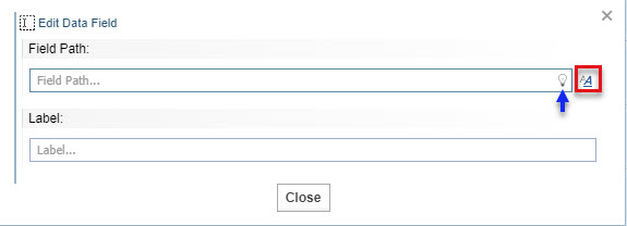
To edit a Data Field:
-
Change the field path.
Click the bulb icon
 for suggestions.
 See Field Path Notation and Field Path Notation Syntax for more information.
-
If you want to apply styles to the content, click the formatting icon
 .
. -
Select No, to not display a line under the field value.
For example, the first field below has the Show Underline option set to Yes,while the second field has the Show Underline option set to No.
-
Select the edit mode required.
-
When in Custom Form - allows the field to be edited when the template is assigned as the Edit form for an entity.
-
Always - allows the field to be edited when used in a Custom Report
-
Never - prevents the field from being edited.
-
-
Enter a label. This is a static title that describes the data shown by the field path.

All Fields and All Features
The All Fields and All Features components have the same controls. The examples below are based on the All Fields example, however, the All Features dialog behaves in the same way.
The All Fields component adds all the available fields for the selected node type.
The All Features component adds all the available features for the selected node type.
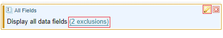
To edit All Fields use the  icon or click on n exclusions link.
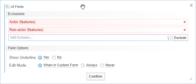
Exclude fields or features
You can choose to exclude selected fields/features from the display.:
-
Click the lightbulb icon
to select a field/feature for exclusion. -
Select . Result: The exclusion is added to the display, highlighted in Red.
-
Add more exclusions, if required.
-
Remove an exclusion by clicking on the remove icon, if required.
-
Select to apply the changes.