Custom Report Components
Custom Reports Only
The Report Components are for use in Custom Reports only.
If you add a Report Component to a template, and then assign that template as a Search Form or Edit Form, a message will be displayed:
The following components can be used to define Custom Reports only:
-
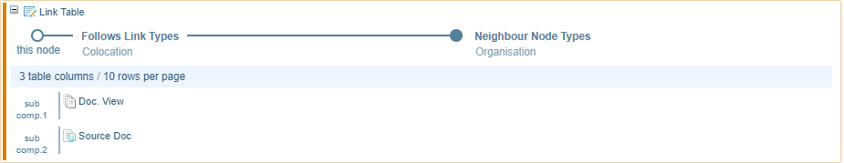
Link Table and Link Target Components - creates table based on neighbour nodes linked to the record.
-
Text Snippets - creates a list of document excerpts associated with the node.
-
Document View - provides a link to document(s) associated with the node.
-
Source Doc - provides a link to source document(s) associated with the node.
-
Image - inserts the image associated with the node.
-
Conditional - allows you to put a condition on displaying content.
-
Hyperlink - displays a link to the node on the network.
Text Snippets
You can use the Text Snippets component to show a document excerpt each time the Node Type is marked up.
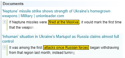
Once you have added the Text Snippet, you can give it a title by typing in the field.

Select the edit icon  to open the Edit Text Snippets Display dialog.

Choose the required settings:
| Show Document Titles | Show or hide the document titles. |
| Show Markups |
Show or hide the markups.
|
| Show Tag Labels |
Show or hide the labels for markups.
|
| Show Speaker Name (transcript only) | Show or hide the name of the speaker (only applies for documents transcribed from audio) |
| Empty Message | Choose a message to display if there are references found in documents for this Node Type. |
| Feature Toggler (advanced) | Advanced feature specific to specialised projects and Apps. Refer to project/app documentation. |
| Snippet Text | You can choose how long to may the document excerpt by choosing the minimum words to the left and right of the text snippet. |
| Documents per page | Choose how many documents to displays per page from the dropdown. |
| Most relevant snippets per document | Choose how many snippets to display per document from the dropdown. |
Document View
The Document View component provides a link to linked document(s).
When added to the Layout Builder they display as follows.

There are no additional settings for this component.
When a document is available, a link View Document is displayed. If more than one document is available, there is a dropdown arrow to display a list of documents.
If no documents are found, the following message is displayed.

Source Doc
The Source Doc component provides a link to the source document(s).
When added to the Layout Builder they display as follows.

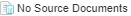
When a source document is available, a link Source Document is displayed. If more than one source document is available, there is a dropdown arrow to display a list of source documents.
If no source documents are found, the following message is displayed.
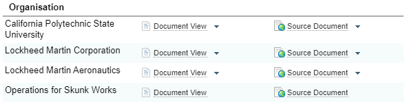
Example using Document View and Source Doc
For example, when displaying a link table for a Person displaying links to Organisations, you can include a column linking to the associated document(s) and source docs.
In the preview, you can see the results:
Image
The image component displays the image associated with the node.
There are no additional settings for this component.
For example, when designing a template for a Person node you could include:
-
the image linked to that person node.
-
a Link Table showing any organisations linked to that person, including the image associated to the linked Organisation node.
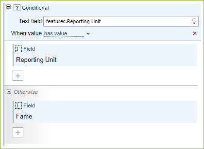
Conditional
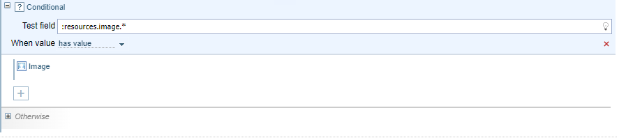
The Conditional Component allows you to place a condition on displaying the content contained in the component.
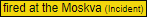
For example, the example below checks that the node image has value. If it does, the image is displayed. If it doesn't, the image is not displayed. This avoids a "No image available" message in the report when an image is not available for a node.
Setting a Condition
To set a condition:
-
select the field or feature you want to test.
-
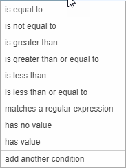
select the required condition from the When value dropdown
-
enter the required value in the right, if required
-
add the component(s) you want to display if the condition is met.
-
(optional) you can add component(s) you want to display if the condition is not met in the Otherwise section.
Combining conditions
To combine conditions within the same Conditional Formatting box, select add another condition. For example, you can check if a value falls within a range by combining "is greater than" with "is less than or equal to".
Otherwise
You can also add a component into the Otherwise location to display if the Conditional set above is not met.
Hyperlink
Allows you to create a link to a Network Graph, Network Table or Network Cluster Refinement for the selected node.

Select the edit icon to open the Configure Hyperlink dialog.
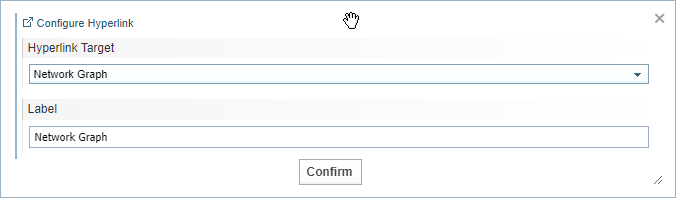
In the Hyperlink Target dropdown, you can choose to link to the:
-
Network Graph (including both nodes and links)
-
Network Table (including both nodes and links)
-
Network Cluster Refinement function (for nodes)
You can give the link a label.
When displayed, the link icon is shown followed by the label. When the user clicks on the link, the selected target will be opened in a new browser tab.
The example below shows a link to a Network Graph with the label "Link to Network Graph".

Timeline View
Allows you to embed a timeline view within the report
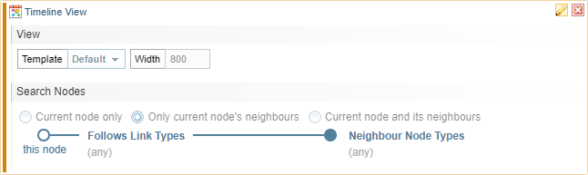
Select the edit icon to open the Edit Timeline View dialog.
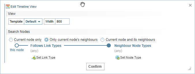
Settings
| Template |
You can choose the Timeline View template to apply to the view from the dropdown. See Timeline Templates for more information on creating Timeline templates. |
| Width | Choose the maximum width in pixels. |
| Search Nodes |
Select the nodes to be included in the timeline.
If you include the neighbours, you can limit the view to include only specified link types and neighbour nodes, if required. |
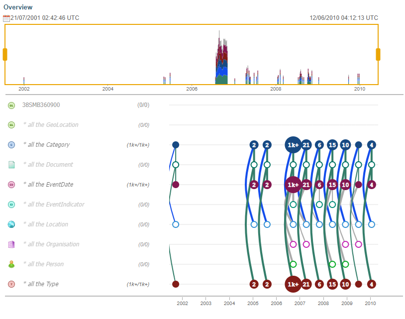
Example Timeline Preview
Below is an example of a Timeline displayed in a Custom Report.
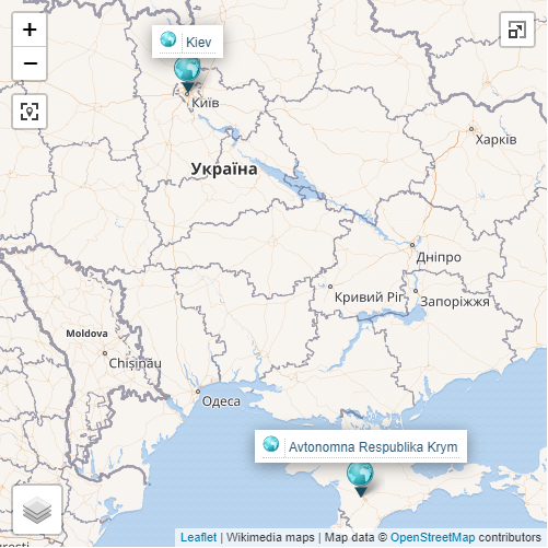
Map
Allows you to display a map identifying locations.
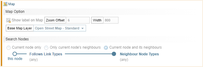
Select the edit icon to open the Edit Map dialog.
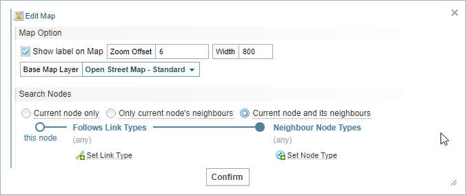
Settings
| Show label on Map | When selected, the location marker has the location name or coordinates shown on the map. |
| Zoom Offset |
Set the initial zoom of the map. This will be limited by the maximum zoom allowed by the map selected in the Base Map Layer option. If many locations are displayed, the zoom will adjust to show all locations. |
| Width | Set the maximum width of the map display area in pixels. |
| Base Map Layer |
Select the style of map to be displayed. The Builtin Map has limited zoom, but will work without an internet connection. The other maps require an internet connection to work. |
| Search Nodes |
Select the nodes to be included in the map.
If you include the neighbours, you can limit the view to include only specified link types and neighbour nodes, if required. |
Example Map Preview