Network Custom Templates
Use of Network Custom Templates
Network Custom Templates, once defined, can be used in:
- Custom Network Search - used when searching the Network. Users can select the search form to use, depending on the entity they are searching for. See Search the Network > Change Custom Search Form for more details.
- Custom Reports - displays the customised reports and allows you to preview and download them in Word format. See Node Details: View, Edit & Report
- Custom Edit Forms - used to edit a entity node's details when viewing Node Details: View, Edit & Report
Setting Default Forms
The Ontology Configuration allows you to create Node (entity) types.
Once the Node type is created, you can create custom templates for that Node type in Network Custom Template configuration.
Once you have created the Custom templates, you assign these templates to the Node type as the default forms to use in the Ontology Configuration.
Process
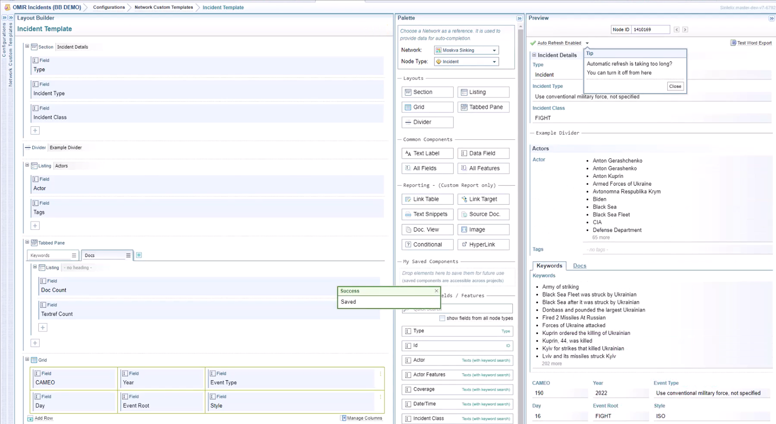
To configure a Network Custom Template:
-
Select Configurations > Network Custom Templates
-
Select the configuration you want to modify.
See Manage Configurations for information on creating, copying, renaming, importing, exporting and deleting configurations.
Once you have opened the form, you can select the collapse icon
 to collapse the Configurations and Network Custom Templates panes to give you more screen space.
 -
At the top of the Palette pane, select the Network and Node Type you are creating the form for.
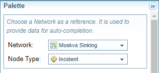
Result: The Node fields and features listed in the Palette pane will be updated.
-
Add and modify components from the Palette pane to create the custom template in the Layout Builder pane.
-
Use the Preview pane to test the results.
-
Select the button.
Demo of creating a custom template
Click on the image below to open a demo of creating a Custom Template.
Add and Modify Components
The Palette pane contains the components to control the layout of the template and to add content including data fields and features, images, maps, timelines and more...
For more information about the components available and what they do, see Types of Components.
Drag and Drop components
You can drag and drop components to move them between the Palette pane and the Layout Builder pane.
Hover over the icon of an component until the cursor changes to a hand. Then click and hold the mouse button as you move the component to the position required.

As you move the component into the Layout Builder pane, the places you can place the component are highlighted in green.
When you hover the component over that position correctly, the position has a dark green border, indicating you can drop the component.
Positions between components are shown as a green dashed line.

When ready to drop, the green becomes a solid green line.
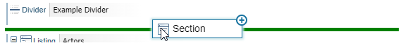
Positions at the end of a component are shown as a green box.

When ready to drop, the green box has a solid green border.

Add components
You can add components to your template by either:
-
dragging components from the Palette pane and dropping them into the Layout Builder pane.
-
selecting the
 icon and selecting the component you want from a dropdown list.
Move or copy components
Move components by selecting the component icon and dragging and dropping it to another position.
Copy components by holding the SHIFT key while dragging the component to another position.
Modify elements
Once positioned in the Layout Builder pane, you can select an element to modify the settings, by selecting either the options menu icon  or the edit icon
  .
.
Remove elements
To remove an element, hover over the element and select the remove icon  .
.
Types of Components
There are a range of different types of components you can use to control the layout and the information displayed.
Layout components
The layout components help organise content in the template.
-
The Section and Listing components allow you to group components under a heading.
-
The Grid allows you to organise the components and its values in a table format.
-
The Tabbed Pane allows you to create a horizontal sequence of tabs.
-
The Divider adds a horizontal line which can include a heading.
Common components
Common components can be used for all types of templates (whereas the Reporting components are for custom reports only).
-
The Text Label component allows you to add any text to the template.
-
The Data Field component allows you to define your own field/feature using field path notation when the field/feature you want to add is not listed in the Individual Fields / Features section.
-
The All Fields and All Features components have the same controls.
-
The All Fields component adds all the available fields for the selected node type.
-
The All Features component adds all the available features for the selected node type.
-
Reporting components
The Reporting components are designed to be used on Custom Report only.
-
Link Table and Link Target Components - creates table based on neighbour nodes linked to the record.
-
Text Snippets - creates a list of document excerpts associated with the node.
-
Document View - provides a link to document(s) associated with the node.
-
Source Doc - provides a link to source document(s) associated with the node.
-
Image - inserts the image associated with the node.
-
Conditional - allows you to put a condition on displaying content.
-
Hyperlink - displays a link to the node on the network.
-
Timeline View - displays a network timeline view.
-
Map - displays locations on a map.
Saved Components
Once you have created and modified the settings for a component, you save it to be used in the again future by saving it to the Saved Components section.
To save or use a saved component, drag and drop to and from the My Saved Components section of the Palette pane.
The Saved Components are not stored in the project. They are unique to the user who created them and can be used across projects.
Fields / Features
When you select a Network and Node Type at the top of the palette, the fields and features associated with that node type are listed as Data Field components in the Individual Fields / Features section. This makes it quick and easy to add this information to a custom template. See Field/Feature Data Components.
Preview pane
You can see the results of your template design in the Preview pane.
Node Selection
To see the results using different node details, you can either enter a Node ID or use the forward and back arrows to navigate between nodes.

Autorefresh
By default the preview will refresh each time you make changes in the Builder Layout. However, for some more complex components there may be a slight delay in the update. You can choose to refresh on demand by clicking on the Auto Refresh dropdown. You can also turn off Autorefresh if you experience performance issues.

Preview Export to Word
For Custom Reports, you can also select the Test Word Export option to view the report in the exported Word format. See Export to Word for more information.
