Link Table and Link Target Components
Custom Reports Only
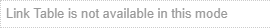
The Link Table and Link Target components are for use in Custom Reports only.
For example, if you add a Link Table to a template, and then assign that template as a Search Form or Edit Form, a message will be displayed:
Link Table
The Link Table allows you to display information about:
-
neighbour nodes (connected by links to the source node).
-
links between the source node and neighbour nodes.
You can configure the columns in the Link Table to display fields, features or components.
Export to Word
At the time of exporting a custom report to Word, you can choose a maximum number of rows in the link table to include in the export. See Export to Word.
Link Table Component
The Link Table component provides a summary of the links reported by the component.
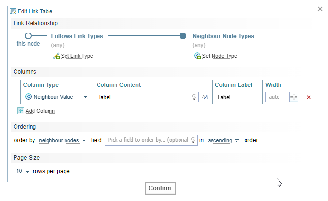
Edit Link Table Dialog
When you add the Link Table to the Layout Builder pane, the Edit Link Table dialog is displayed. You can also select the Edit button  on the component to open the edit dialog.
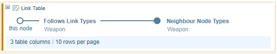
Link Relationship
The table can display all links or selected link types.
To limit the Link table to specific types of links:

|
Select Set Link Type and enter a link type. Click the lightbulb icon Leaving the link type blank includes all link types. |
|
Select Set Node Type and enter a node type. Click the lightbulb icon Leaving the node type blank includes all node types. |
 for suggestions.
You can add multiple types of links to node relationships.
Table Columns
You can choose columns to add to the Link table. By default, the neighbour node label is selected as the first column.
For each column:

|
Add Column |
Select the Add Column option to add a new column |
|
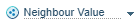
Column Type |
Select the Column Type (see descriptions below) |
|
Column Content |
Change the field path. Click the bulb icon See Field Path Notation and Field Path Notation Syntax for more information. |
|
|
Format |
If you want to apply styles to the content, click the formatting icon |
| Column Label |
When required, enter a Label for the column. |
|
|
Width | Adjust the column width
|
|
Sort |
Adjust the column order by click and dragging the order icon |
|
Remove |
Select the remove icon |

List
The link table will display as a list if you create a single column table without a label. This will display a full-width vertically stacked link list.
Table Columns Types
Select the Column Type dropdown to choose from the following Column Types.
| Neighbour Value |
Display information about the link neighbour, for example, the label. Click the lightbulb icon |
| Sub-Component |
Add a component to the table, for example, include the node image or link to the node document(s). See Sub-Component below. |
| Link Value |
Display information about the link, for example, the type of link or the document count for the link. Click the lightbulb icon |
| Direction |
Show link direction, displayed as a chevron You can choose the order between:
|
 , by default the chevron points to the right to the neighbour.
Sub-Component
When you choose the Sub-Component Column Type, the sub-component icon is shown in the component when you close the dialog, ready for you to add a component.
You can drag and drop (or click the plus symbol) to add a component to the link table.
You can create link tables within link tables. However, processing speed and memory will be impacted with multiple nested Link Tables.
Neighbour Node focus
A Link Table allows you to provide information about neighbour nodes linked to the Source node.
When you select the Sub-component Column type, by default the focus shifts from the selected node to neighbouring nodes connected by links.
Link mode
When you select the Link mode checkbox, the focus shifts to the connecting link (instead of the neighbouring node).
For example, if you add a link to a Network Table (using the Hyperlink component) with:
-
Link Mode checked, the Network Table for the Link will be opened.
-
Link Mode unchecked, the Network Table for the Neighbour Node will be opened.
Link Target component
The Link Target component is designed to be used within the Link Table when a Sub-component Table Column has been added in Link mode.
The Link Target component allows you switch the focus back from the link to either the:
-
Link Source node, and
-
Link Neighbour Node.
Click on the link to toggle between the two options.
 <->
<-> 
Ordering
You can choose how the table is sorted into an order.
-
Choose to order by the neighbour notes (default) or connected links from the order by dropdown.
-
Choose the field you want to order by entering or selecting a field using the lightbulb icon
 for suggestions.
 You can use Field Path Notation to select a field to order by.
-
Choose from ascending or descending order by clicking to toggle the settings.
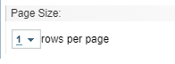
Page Size
Use page size to limit initial displays. Use the page size option to move from one node to another in a 1-1 relationship by setting the Page Size to 1.