Add Layouts
Introduction
The Layout components help organise the content in the template.
For more information on adding, moving, copying and removing components, see Add and Modify Components
Section and Listing
The Section and Listing components allow you to group components under a heading.
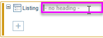
A Listing displays the label and value side by side.
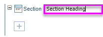
A Section displays the label followed by the value below.
Adding the Heading
Once you have added a Section or Listing component, type in the heading in the field to the right of the component name.
Options
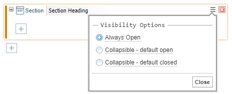
Select the menu option  to change the Visibility Options:
- Always Open.
- Collapsible - default open.
- Collapsible - default closed.
Example
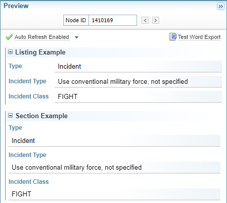
In the example below, both the Listing and Section components have the Collapsible option applied, adding the collapse  and expand
  icons before the heading.
Grid
Using Grid you can organise the components and its values in a table format. The Grid component does not have a heading, but can be positioned inside other components, for example the Section component.
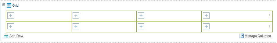
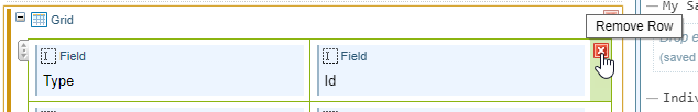
Manage rows
You can:
-
add rows using the
 Add Row option, and
 -
remove a row by selecting the remove icon
 .
.
Manage Columns
You can click on the Manage Columns button to display the Change Columns dialog:
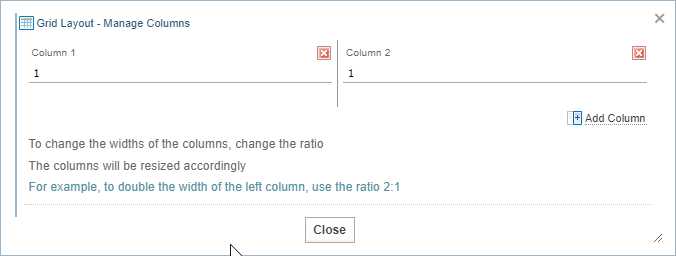
-
add columns using the
 Add Column option, and
 -
adjust the column widths by changing the number in each column to adjust the ratios.
For example, to make column one double the width of column two, you enter 2 into column one and 1 into column 2.
-
remove a column by selecting the remove icon
.Removing a column removes all containers, components, fields and features within that column.
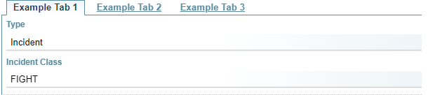
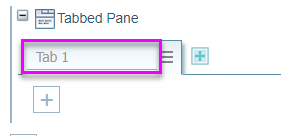
Tabbed Pane
The Tabbed Pane allows you to create a horizontal sequence of tabs.
Tab Headings
Enter the tab heading in the tab field.
Add more tabs
To add more tabs, click the add  button.
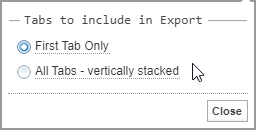
Exporting tabs
Select the menu icon to display options for exporting tabs to Word.
You can choose to export:
-
the first tab only, or
-
All tabs, exported vertically in sequential order, from the first tab to the last.
Moving Tabs
Clicking on the options menu allows you to move tabs left and/or right to change their order.
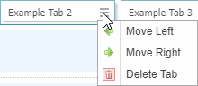
Delete a Tab
To remove a tab, select Delete tab from the options menu.
Select a tab
Switch to any tab by clicking on the tab label.
Divider
A divider add a horizontal line. It can be used to separate components or sections for the template.

You can add a heading to the divider.

Remove a divider by selecting the remove icon .